IPW1 Brand Development
Branding
- Branding
- Brand Messaging
- Window and Wall Graphics
- Promotional Items
IPW1 is a leading independent printer based at Tower Bridge in London. With a dedicated team and excellence in service, they work with some of the largest restaurant chains, galleries and PR companies in the country, delivering top quality print and finishing.
We bonded over menus several years ago and have worked together ever since. So, we were delighted when they asked us to help develop their brand further with the specific request of ensuring it represented their full range of offering, stellar services and the great personalities within their team, whilst making a statement and creating a real business impact. Their brief was simple. To really express how they bring print projects to life, especially with their advanced use of colour. In general, the clients imagination is the only limit and IPW1 are 100% dedicated to deliver the highest standards in the industry.
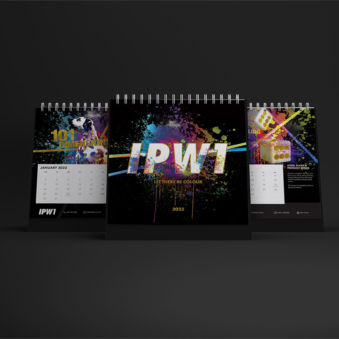
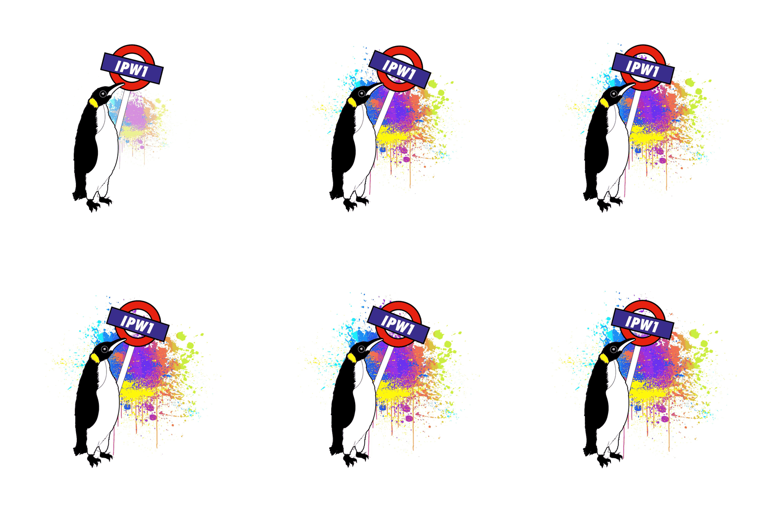
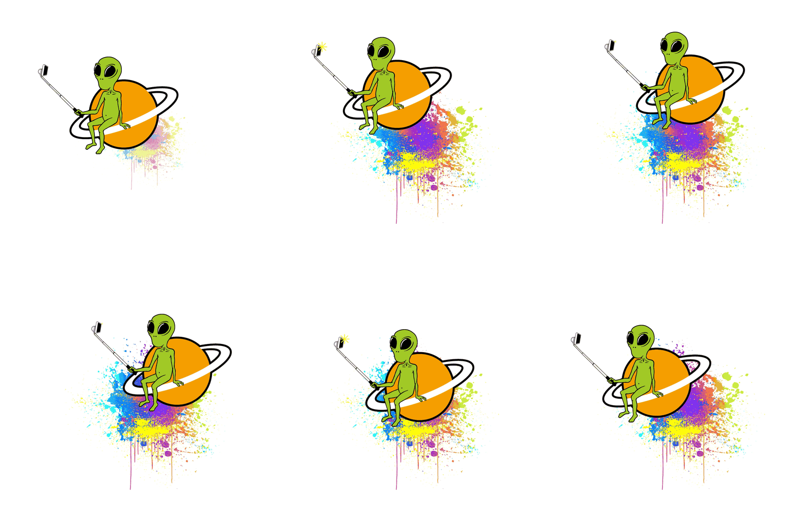
“We want to create The Colourdome” the owner Peter said. We love a brief where our imaginations can run riot! And so, The Colourdome was born. We created a world where anything goes. The usual black and white objects in the universe, were blasted with colour – the penguin, the football, the domino, the snowman…all featured in a colourful calendar and demonstrating various finishings examples as a promotional piece.
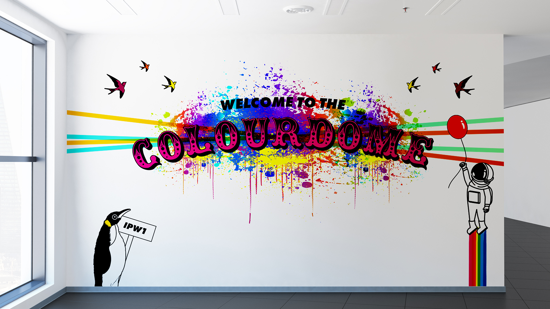
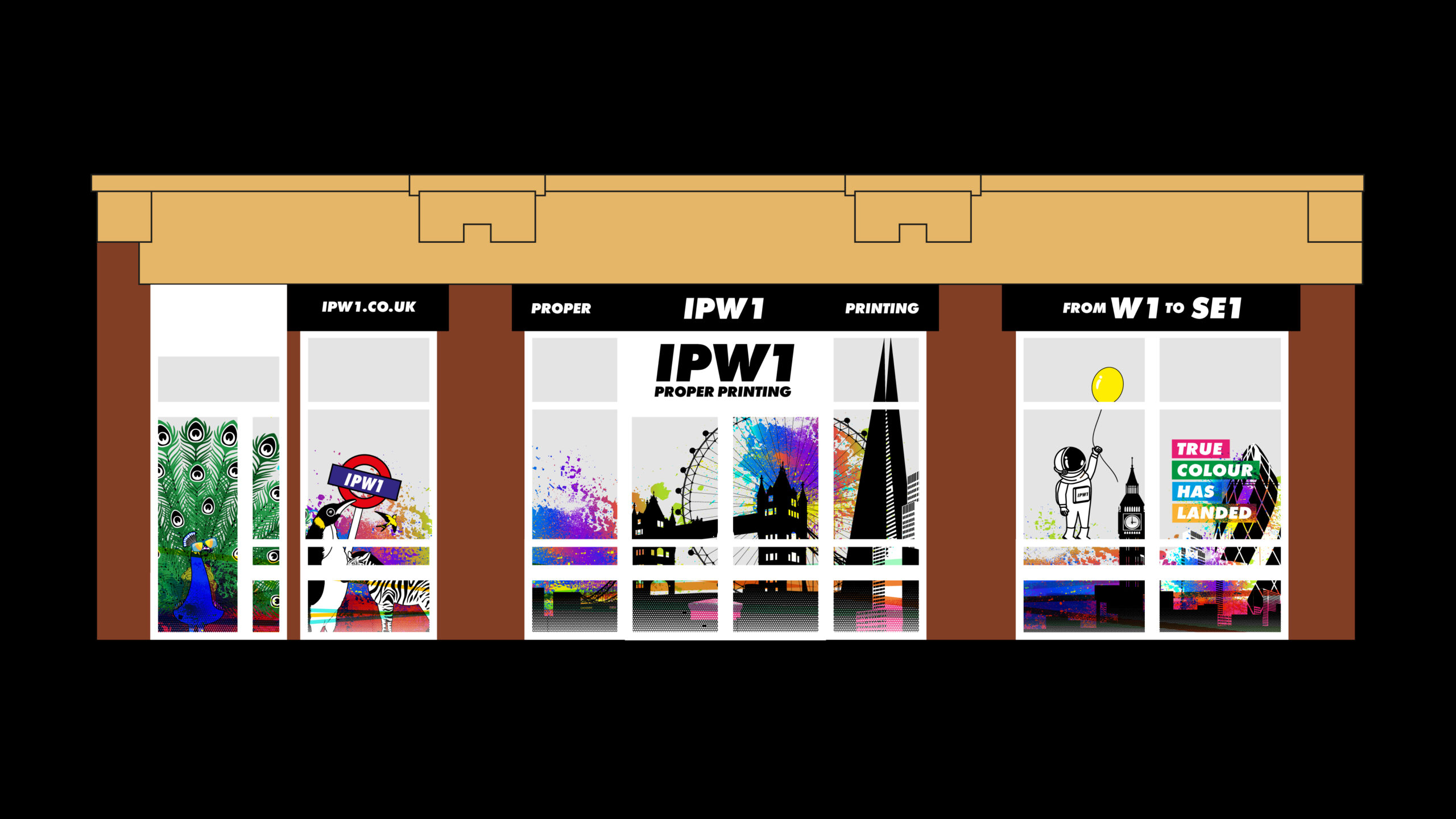
As they recently moved address, we also created window displays that illustrate an astronaut floating in with a balloon in a land of rainbows, zebras and peacocks, to show that ‘colour has landed’ in their new location.
It’s all very eye-catching, gets the message across clearly and is a really flexible addition to their brand assets and is a bit of fun – which we felt was crucial to get across their down to earth, friendly and attentive personalities and approach within the team.
It’s such a pleasure to work with open minds, creative briefs and a fantastic team. Keep an eye out for the next window instalment…
All In Brand Strategy
Branding
- Brand strategy
- Brand support
- Project management
- Copywriting/tone of voice
- Campaign concept
Alliants are the trusted digital partner of choice in the luxury hospitality space. As global market trendsetters, they lead and innovate first-class digital solutions and are passionate about developing the guest experience platform of the future. Working with some of the world’s most respected luxury hotels, travel, and retail brands to deliver exceptional customer experiences.
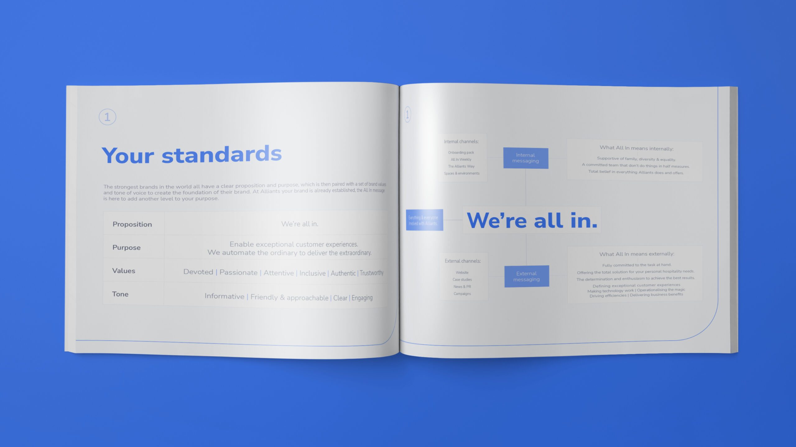
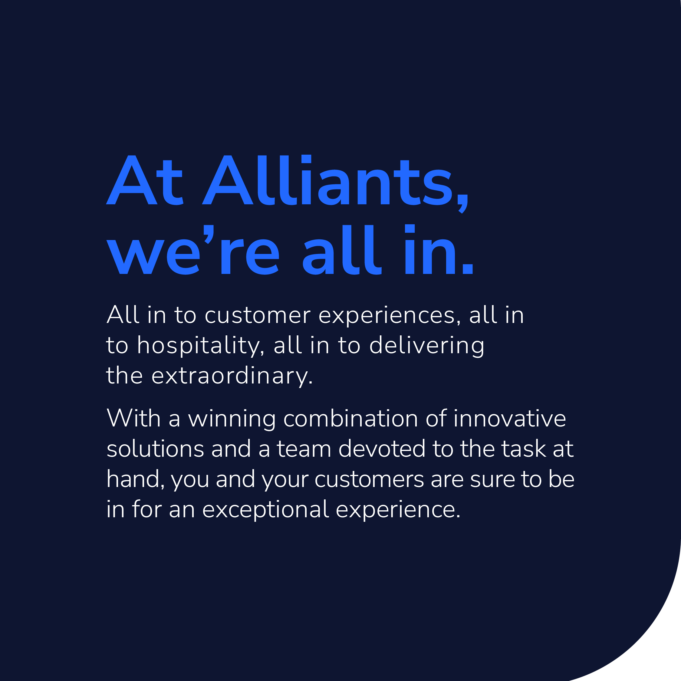
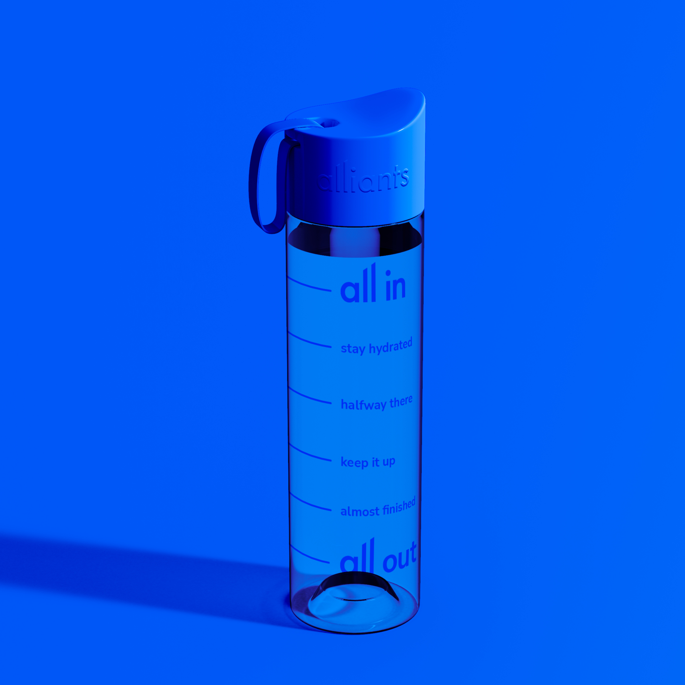
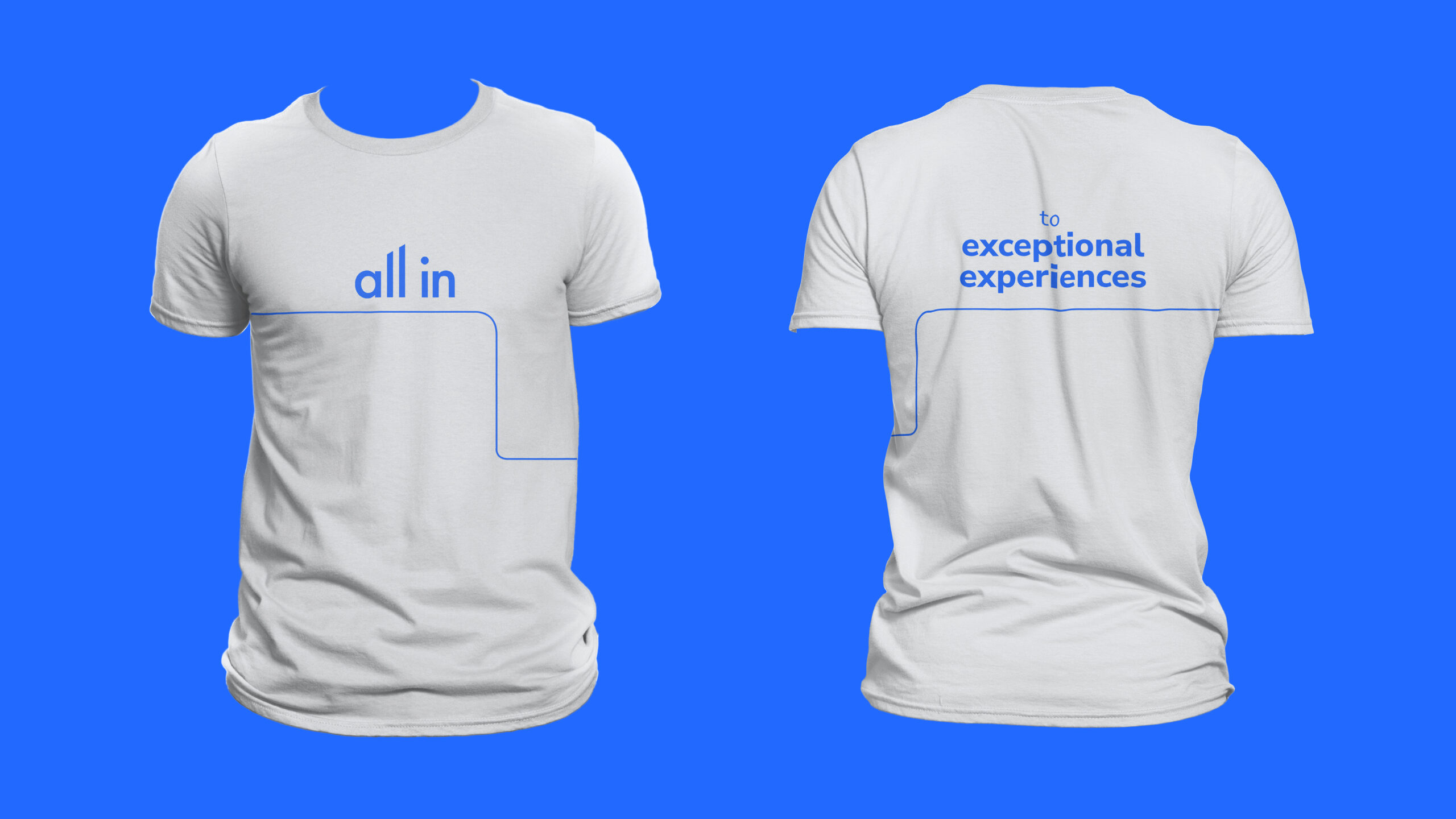
We were asked to create a series of branded gifts for an upcoming event that Alliants were attending. As part of the brief, we researched their ground-breaking app and applied a simplified logic to define what their client proposition really was. Alliants loved the result so much that they applied it across their whole brand internally and externally.
The Alliants app is an innovative hospitality concierge app with a difference. By applying or building custom modules, their clients can create a bespoke mobile app which can take their business to the next level.
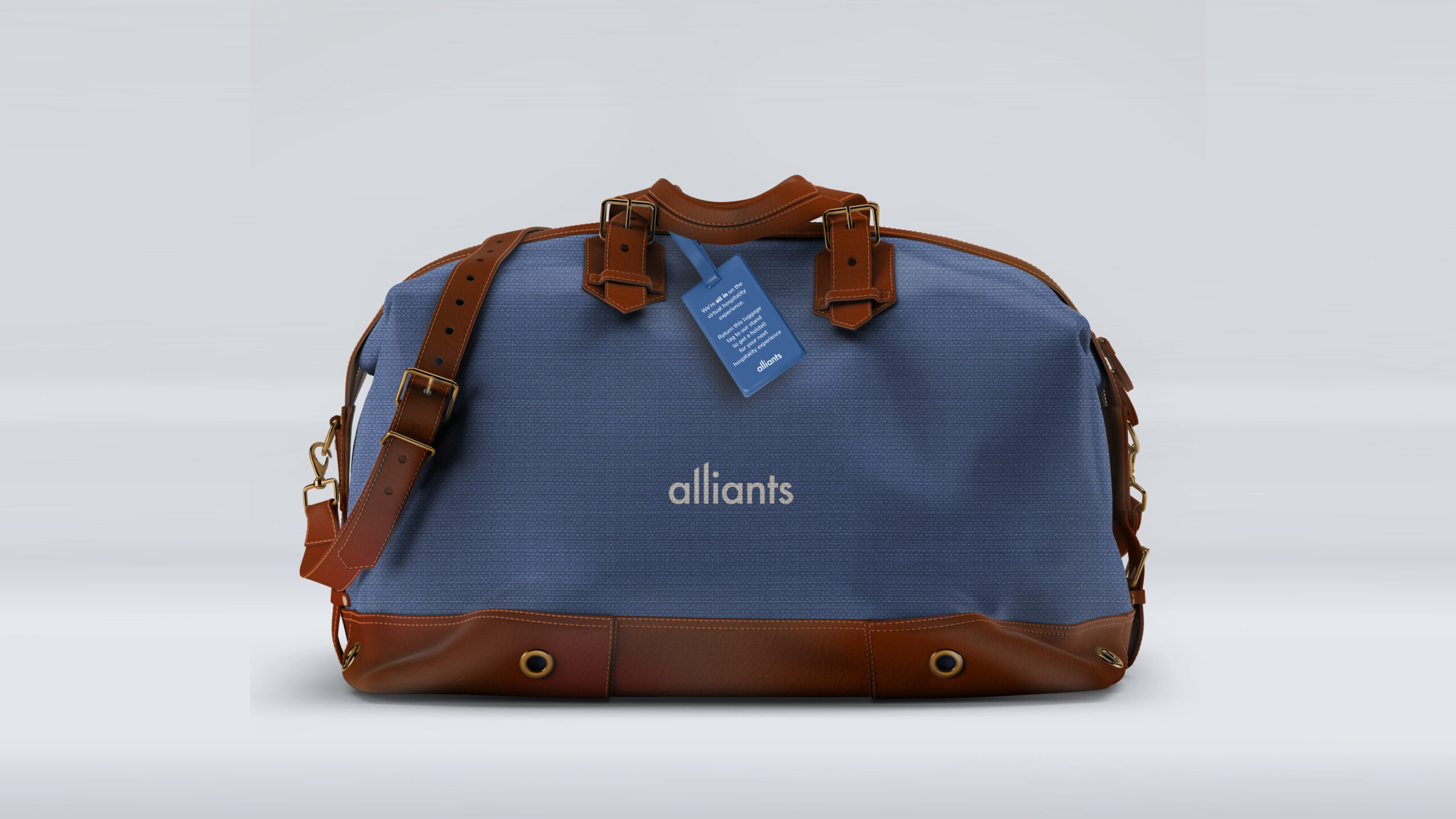
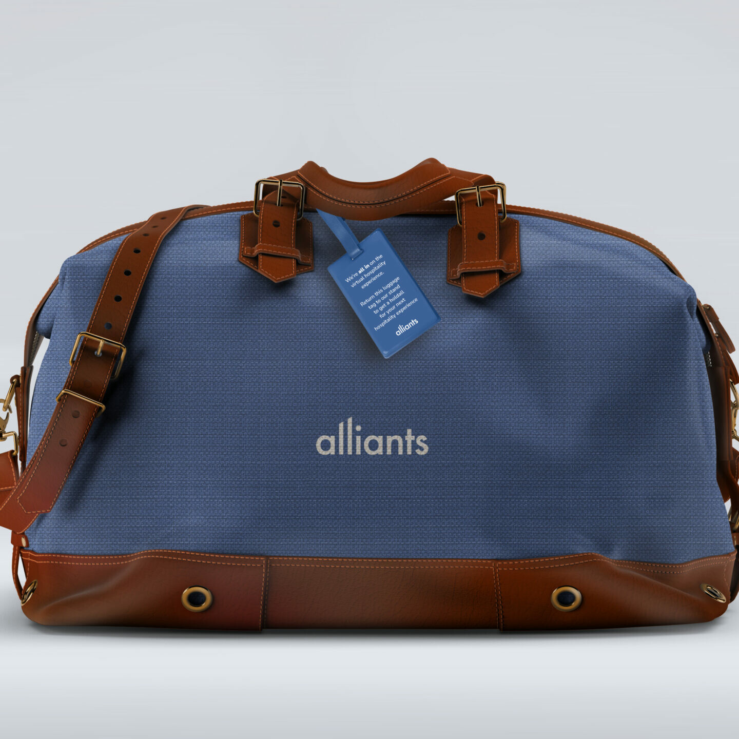
We created an Alliants holdall for an event their team were attending. They wanted to give prospects a gift that they felt represented their proposition fully. We applied the words ‘all in’ to a premium holdall as we felt that when you take a trip you need a bag that holds it all, just as you may also need an app that has all your documentation, itinerary and concierge inside it.
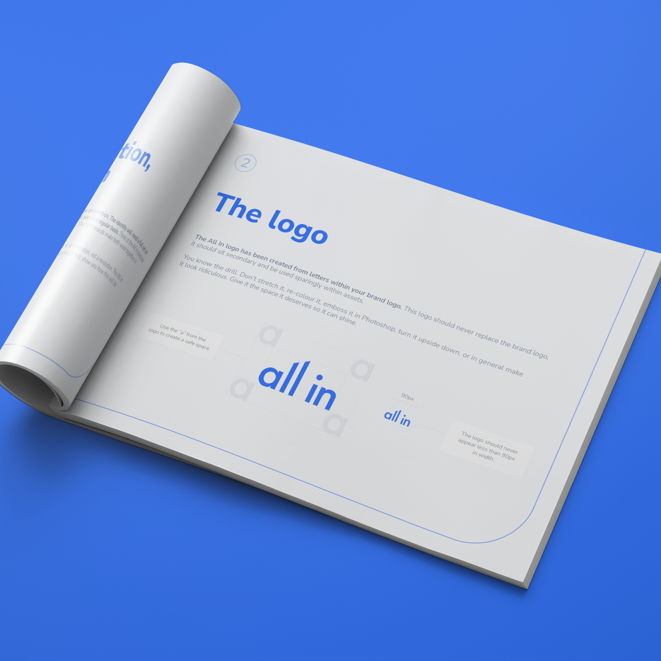
By creating the ‘all in’ word mark from the Alliants lettering, a style was quickly established, which was transferred from the bag to the brand as a whole. Alliants loved the concept so much that we proposed that it became part of their wider brand and communications strategy. The team really adopted the concept, and their internal and external culture was born.
We created a full suite of documents outlining the proposition and messaging, clarifying what All In means for Alliants. This was rolled out across their website, employee onboarding packs, and various campaigns.
Philippa Witheat, Vice President of Marketing of Alliants said:
We appointed Curate based on their track record and knowledge of the hospitality sector. Their ability to quickly grasp and understand a brief is what sets them apart. The ‘All in’ strategy came entirely from Curate thinking differently about who we are and what we stand for. Curate’s ‘outside of the box’ thinking and creative ability is what ultimately gives them the edge.
Having worked with Curate for a number of years I am continually impressed with their creativity and ability to adapt to each challenge that I present them with. To find a full-service agency that delivers unique high-quality work consistently, on time and to a brief is a challenge. It’s rare that you find a creative partner that seamlessly becomes an extension to your marketing team.
Branding and Website Design
Branding
- Branding
- Stationery
- Website design and build
- Social media support
Space VR is a virtual reality and CGI animation company, primarily servicing the architectural sector. With cutting-edge technology and a team of very talented artists, they bring a client’s vision to life. From interior design and architecture to product design and animation, they have it covered.
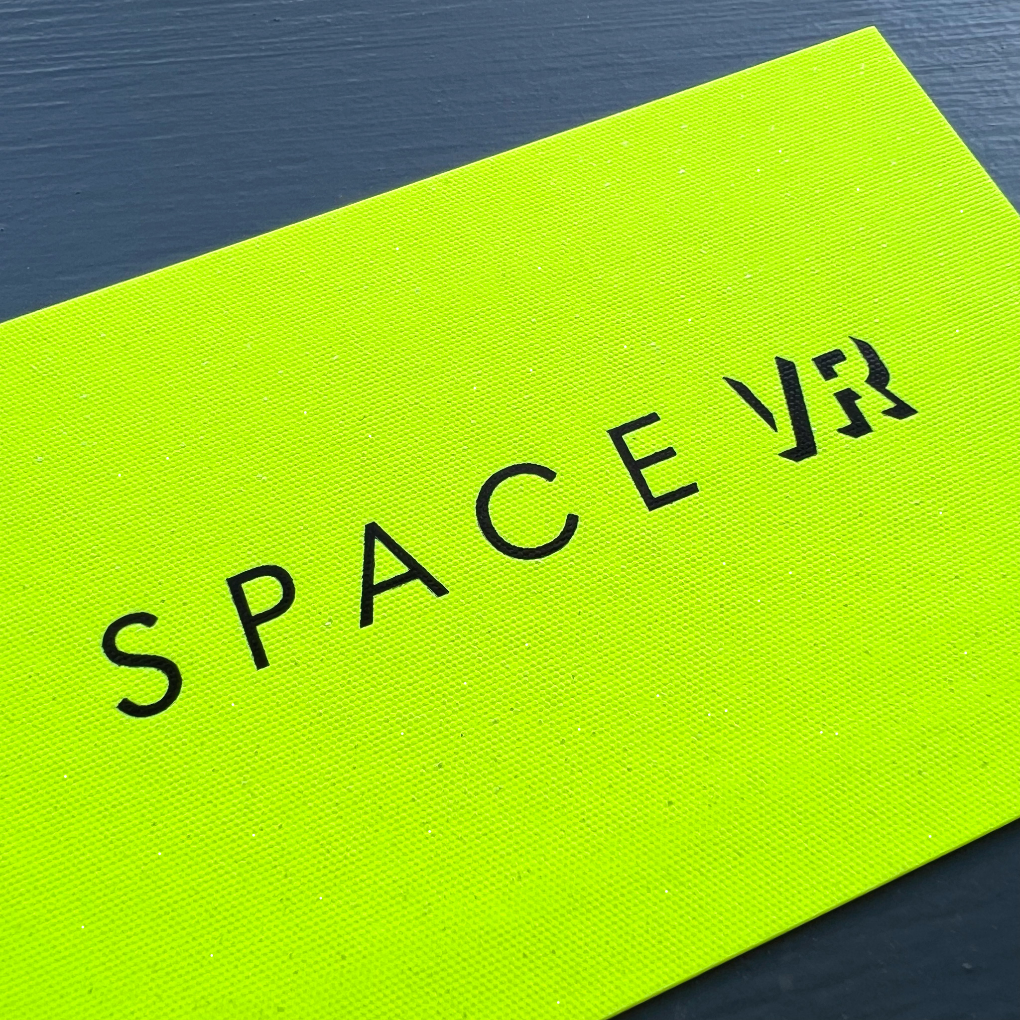
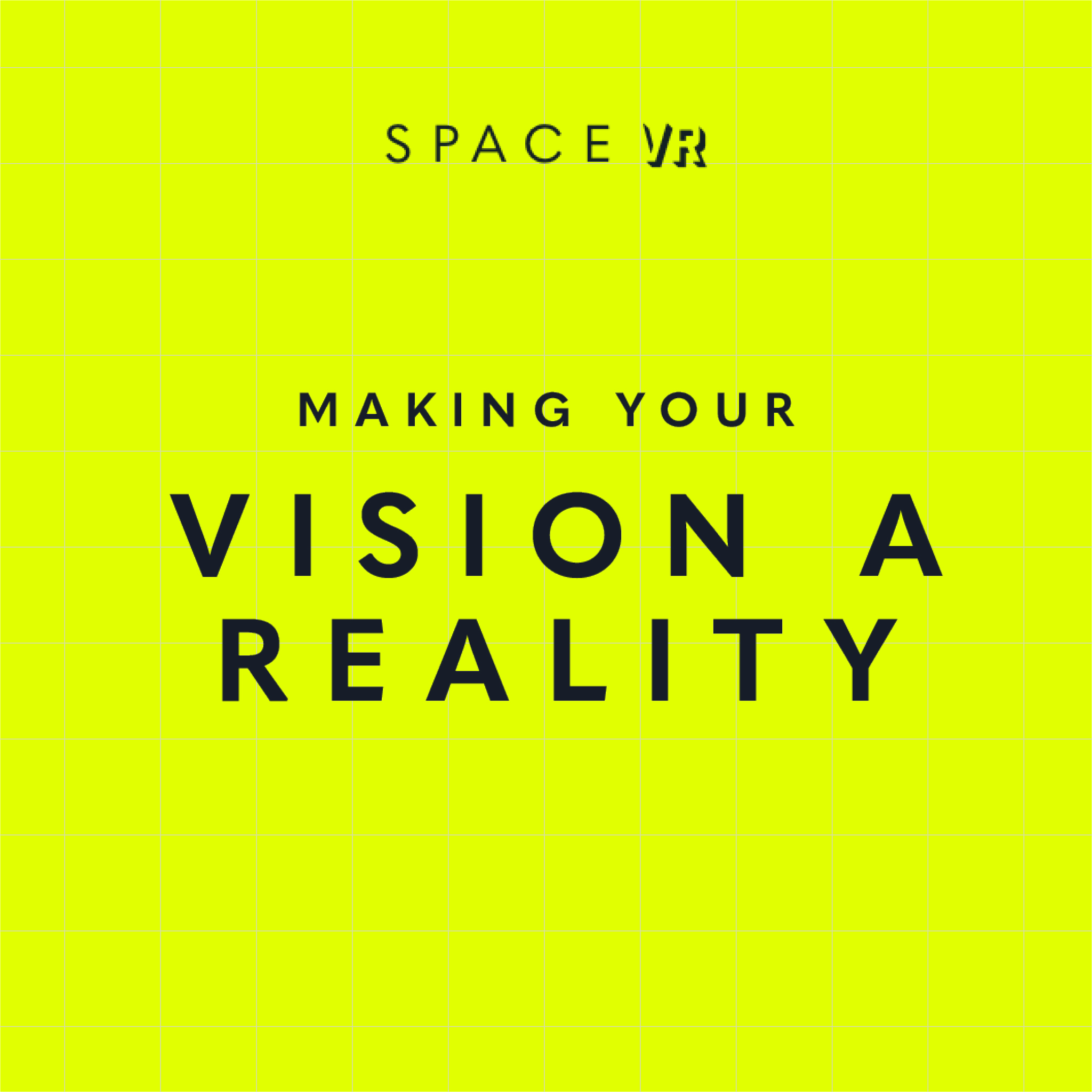
We work with their team as their creative partner and created their new identity and brand to launch their services. The aim was for the design to feel fresh, forward-thinking and slick, so that it shows off their services in a visual and informative way. This means that whether you understand VR, CGI and photogrammetry or don’t know your 3D from your 360s, their branding and messaging meant they could clearly market their services whilst educating and highlighting the benefits to the customer.
We created icons for each of their services to visually represent them with a clear description of the services.
The typefaces we chose were to look clean and project the ‘VR’ part from the page. We chose a colour palette that includes a soft grey/blue and a super-vibrant acid yellow, to create a sophisticated and confident contrast. Images and video of the services are key within their website to showcase their offering to the fullest, so we worked the branding to support and elevate this with a subtle mapping texture background.
We selected a gorgeous G F Smith paper – Gmund Action Vibrant Arsenic 430gsm for the business cards, printed with IPW1, which had real stand-out.
The team at Space VR were very happy with the results and so are we.
Launch Collateral
Branding
- Brand support
- Menu creation
- Opening collateral artwork
- Back of house document design
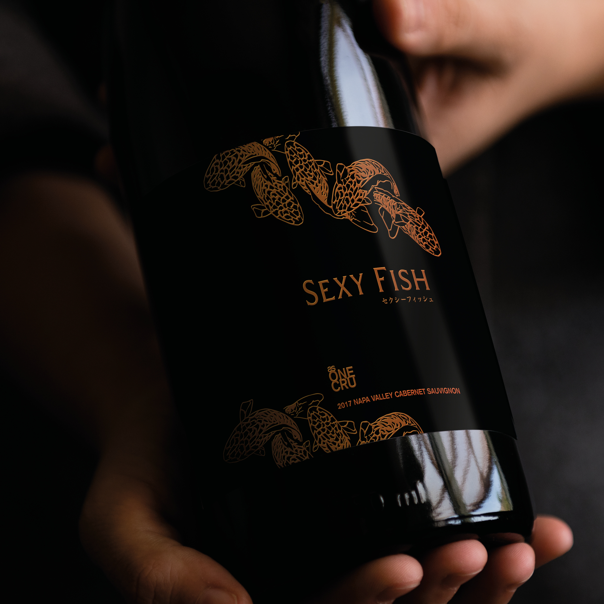
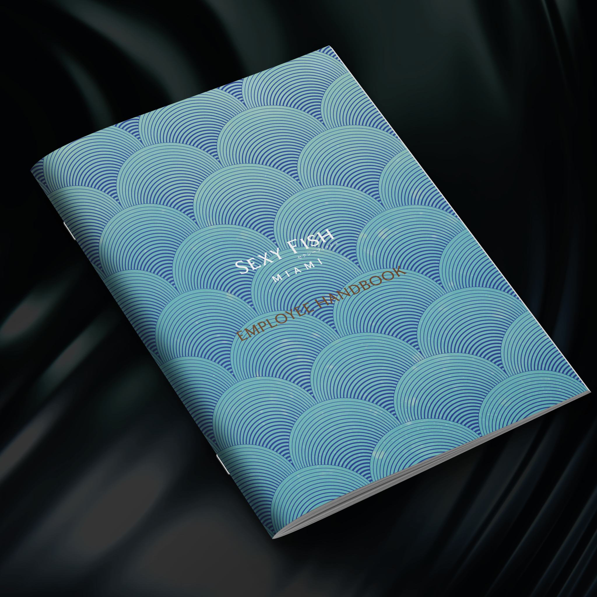
Sexy Fish Miami is a dining experience like no other. A surreal underwater world-inspired space, with original Damien Hirst artwork, a spectacular Asian inspired menu, theatrical cocktails and top International DJs and entertainment.
Having worked with the team on their Sexy Fish London location to support with their brand items, we were asked to help support with their launch for Sexy Fish Miami. We produced handbook documents for back-of-house, operational items from labels to menu layouts, and digital assets such as social assets for DJ nights and email assets.
This location involved it’s own beautiful illustrations by Adam Ellis, and making sure the marketing worked with the Miami audience. Working with the team internationally means working with different time-zones, markets and tailoring menu content and events to this market has been really fun and interesting to work with.
It’s amazing to see that it’s now celebrating its 1st Anniversary. Congratulations all round.
Boutique Hotel Branding
Branding
- Brand creation and curation
- Website development and creation
- Tone of voice and copy
- Print and digital assets
- On-going support
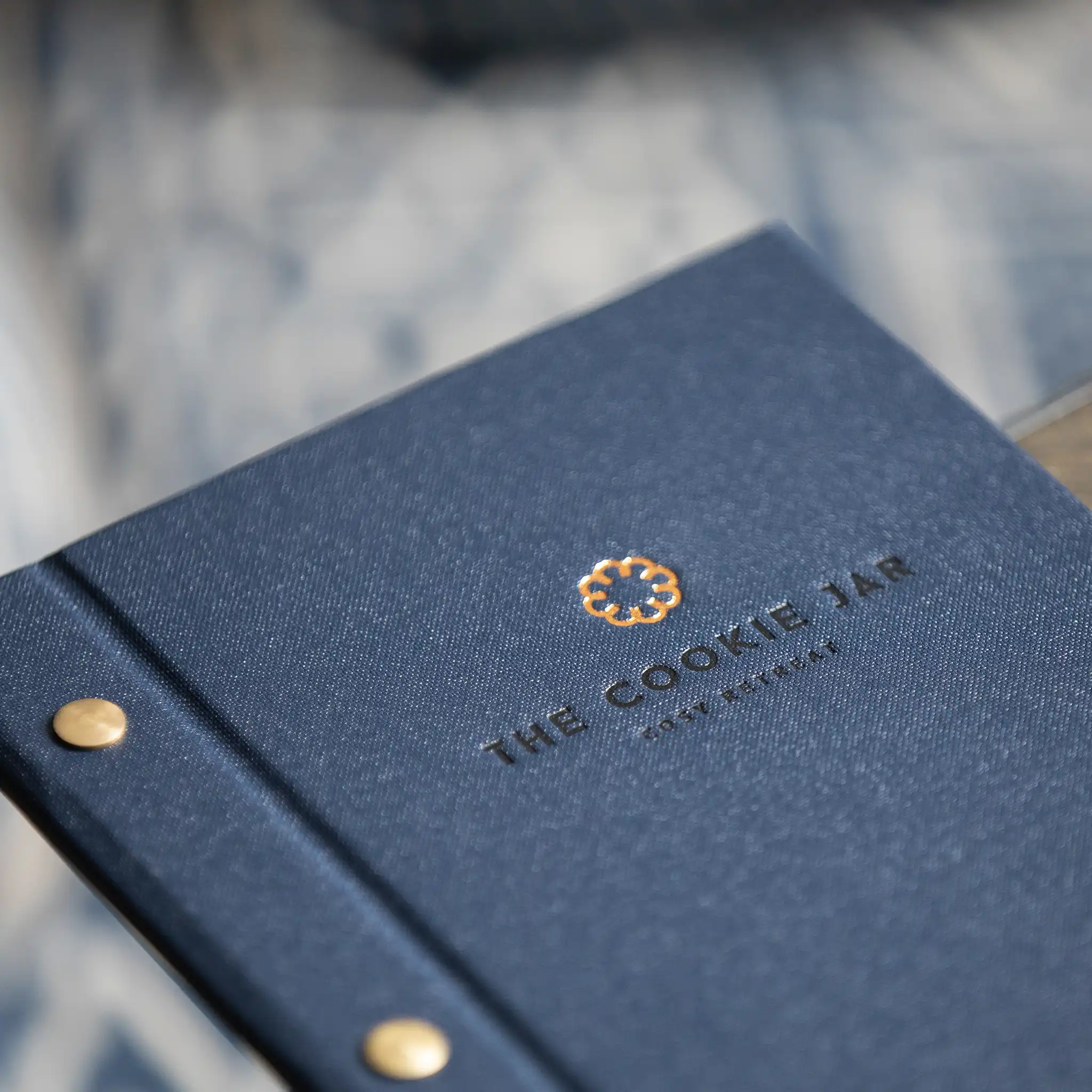
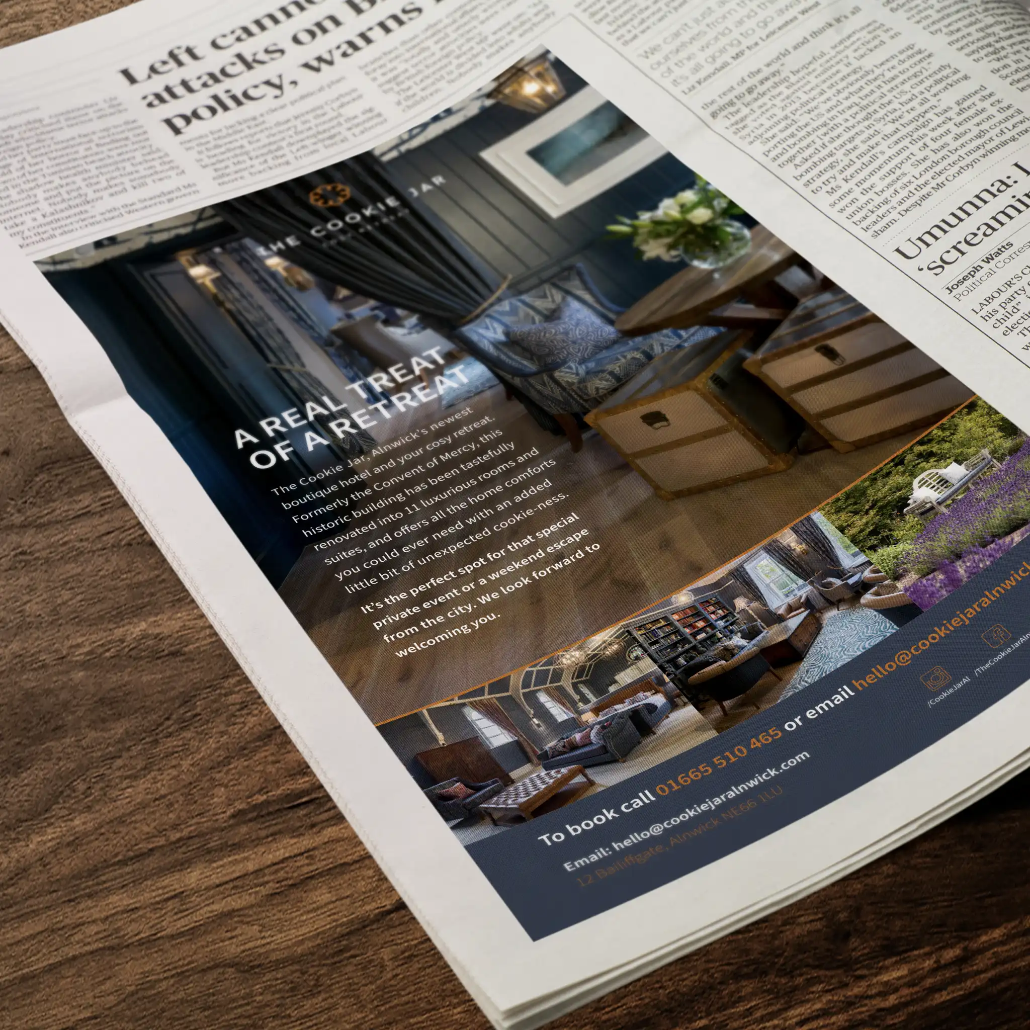
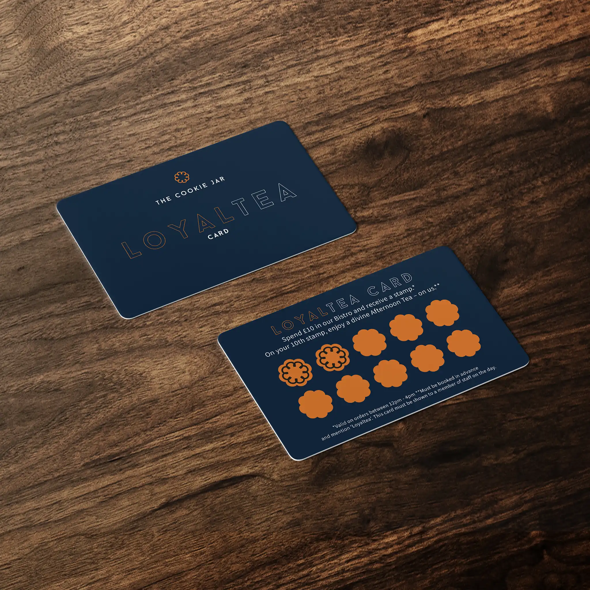
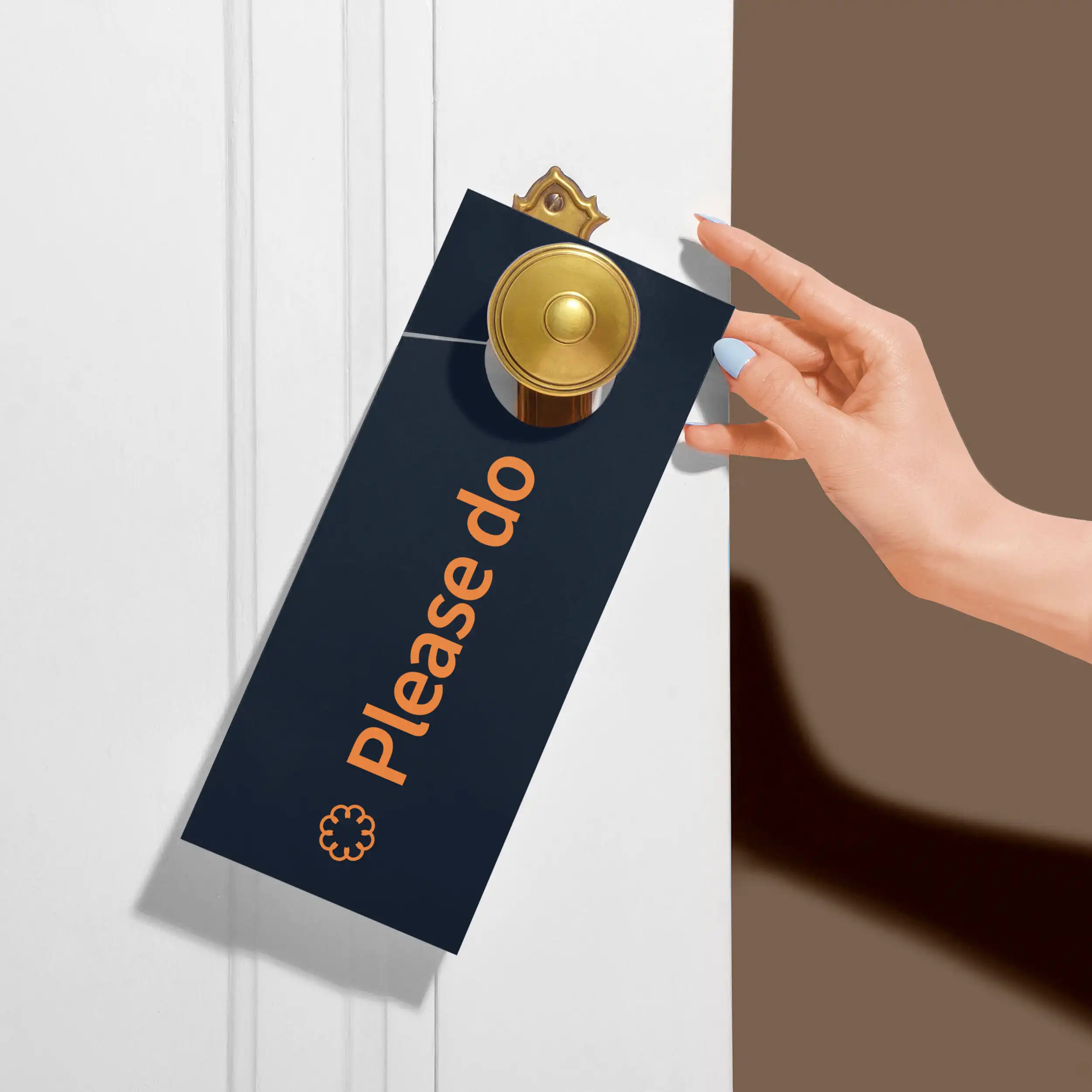
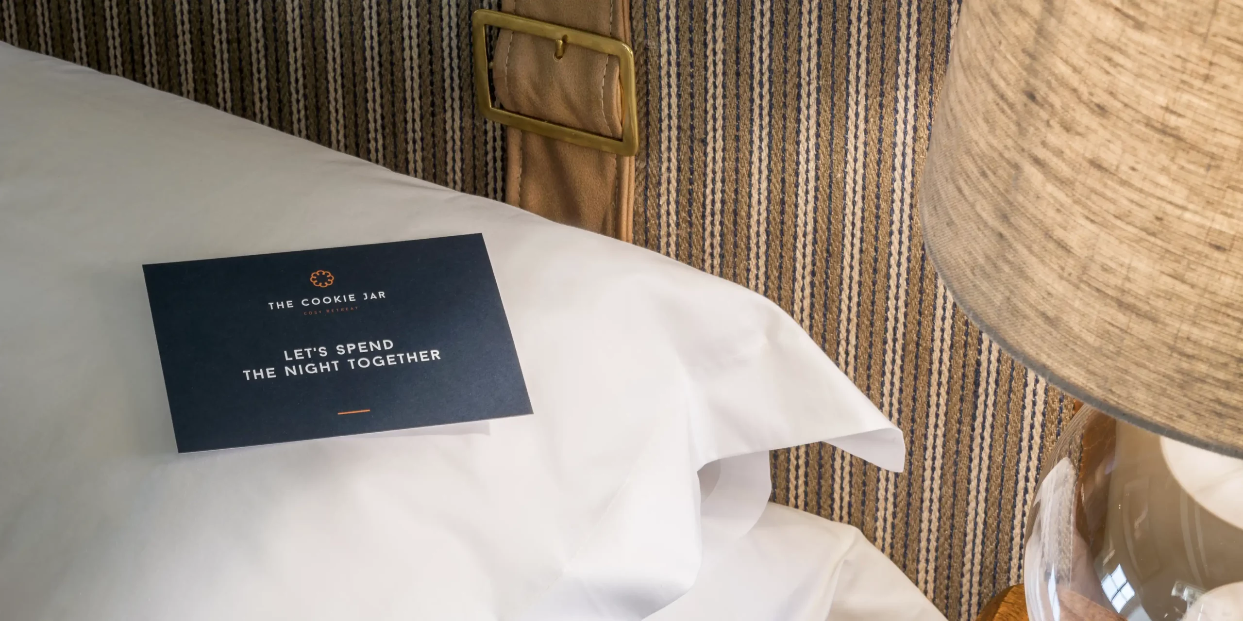
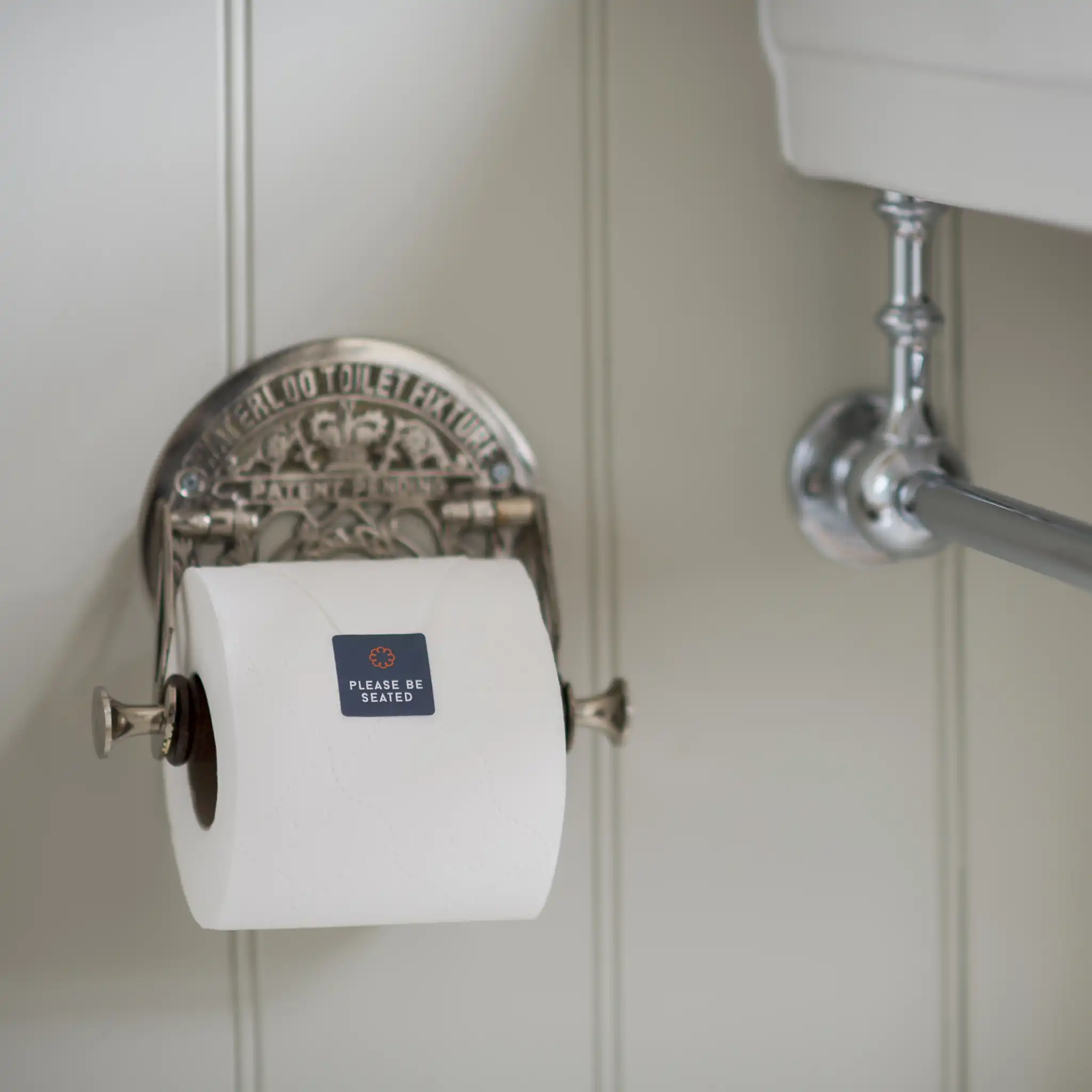
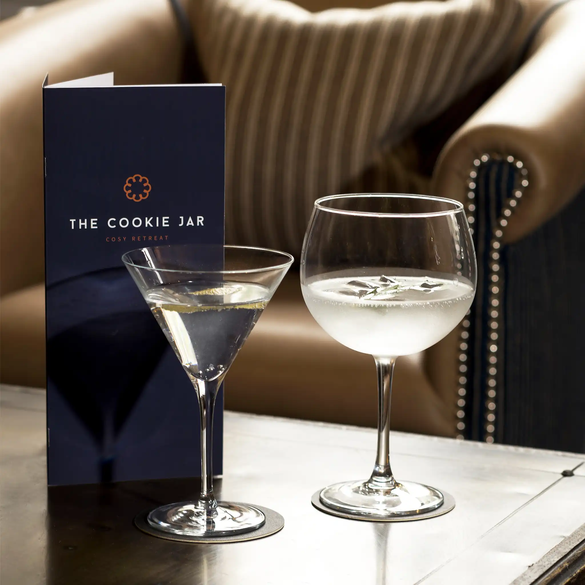
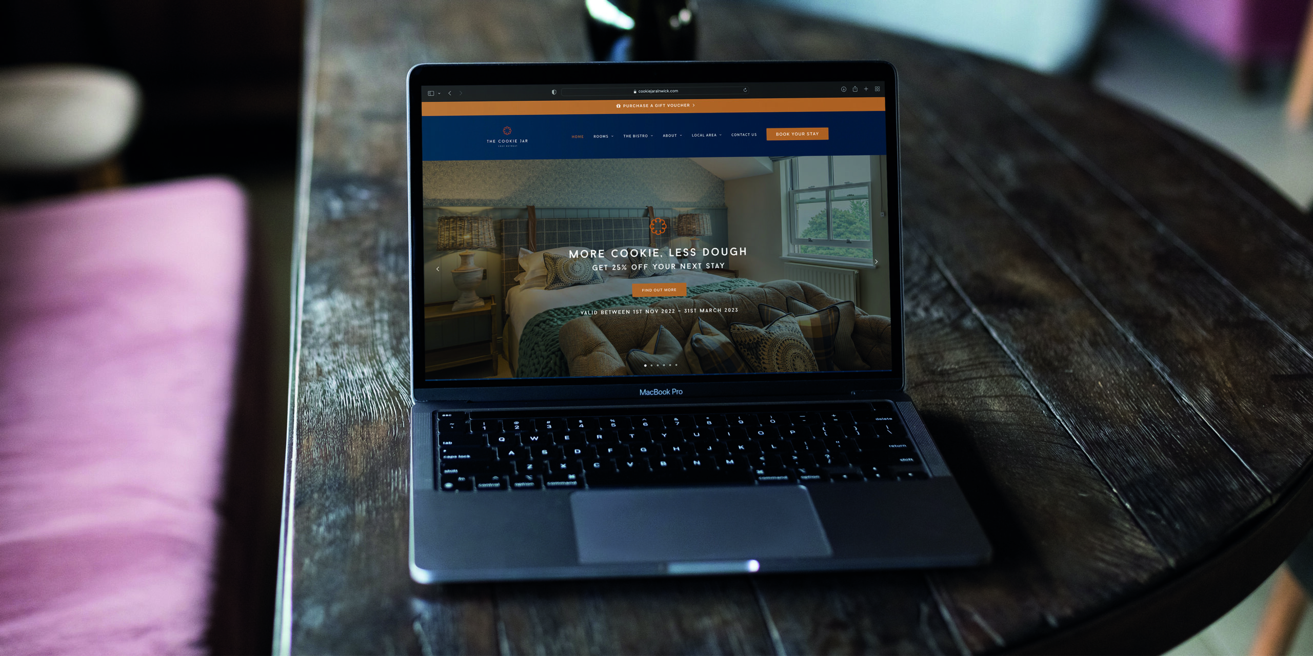
Welcome to The Cookie Jar. This wonderfully cosy retreat in the heart of Alnwick, Northumberland was once the Convent of Mercy. Tastefully renovated into 11 luxurious rooms and suites, this boutique hotel offers all the comforts of home with an added little bit of unexpected cookie-ness. We’ve been on the Cookie journey from the very beginning.
As we explored the site in the middle of its conversion with the owners, we knew this was going to be something special and something to be proud of. We created the branding, the story, the tone of voice and all brand assets including the website design and creation, and all the little Cookie touches throughout.
Now with the hotel in full flourish, we support their team as their creative partner with anything they need. From their regular email newsletter – ‘The Digestive’, to press ads, sales campaigns, menu and website updates.
Brand Chocolate Packaging
Branding
- Creative packaging design
- Project management
- Brand strategy
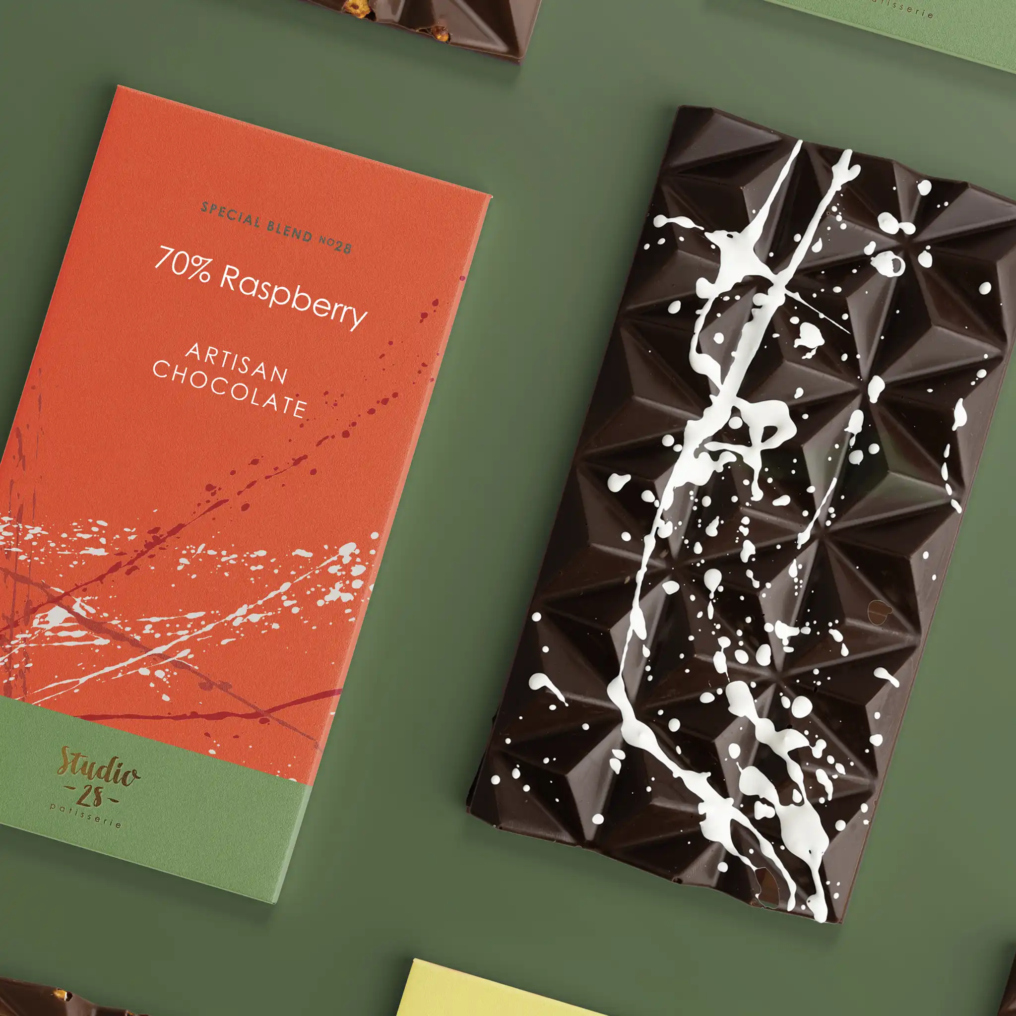
Studio 28 Patisserie is the home of Naomi and her wonderful world of sweet treats. A boutique artisan chocolatier who creates works of edible art. After working on developing Naomi’s brand and website, we were asked to design and align all of the brand’s packaging to elevate the style and quality to be worthy of the high standard of the goodies inside.
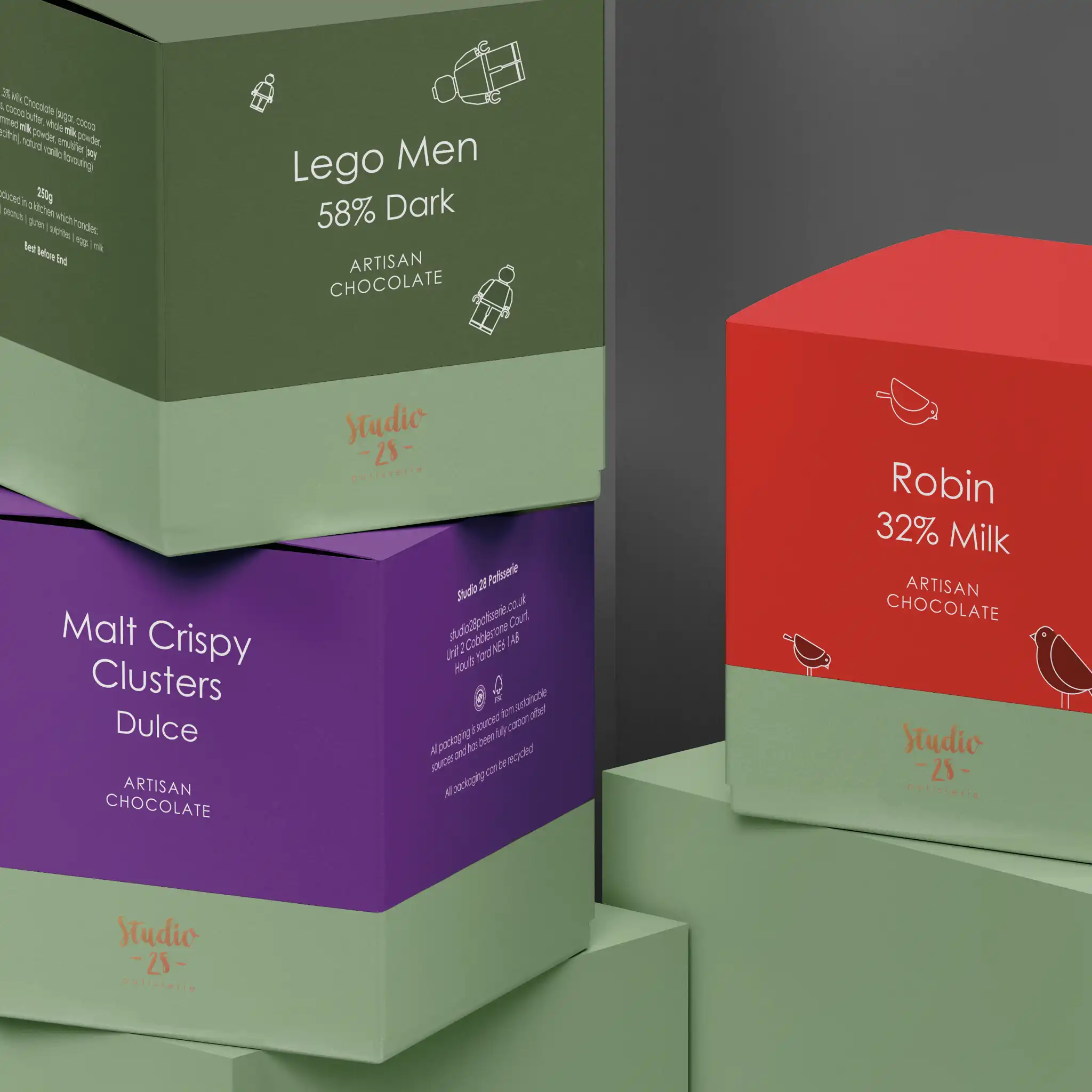
We assessed all of the types and sizes of packaging so that we could align it all and make sure it was created efficiently. Working with a local printer we sourced packaging materials from sustainable sources and materials that have been fully carbon offset.
We wanted the design of the packaging to have a creative feel that was personal to Naomi as she puts her heart and soul into her creations. So we developed the beautiful splash effects she uses on her chocolates, and used a variety of these across the packaging. We created a colour palette to represent each flavour and chocolate type, and also created little illustrations for the boxes that included ‘fun’ elements inside such as lego men and Christmas robins.
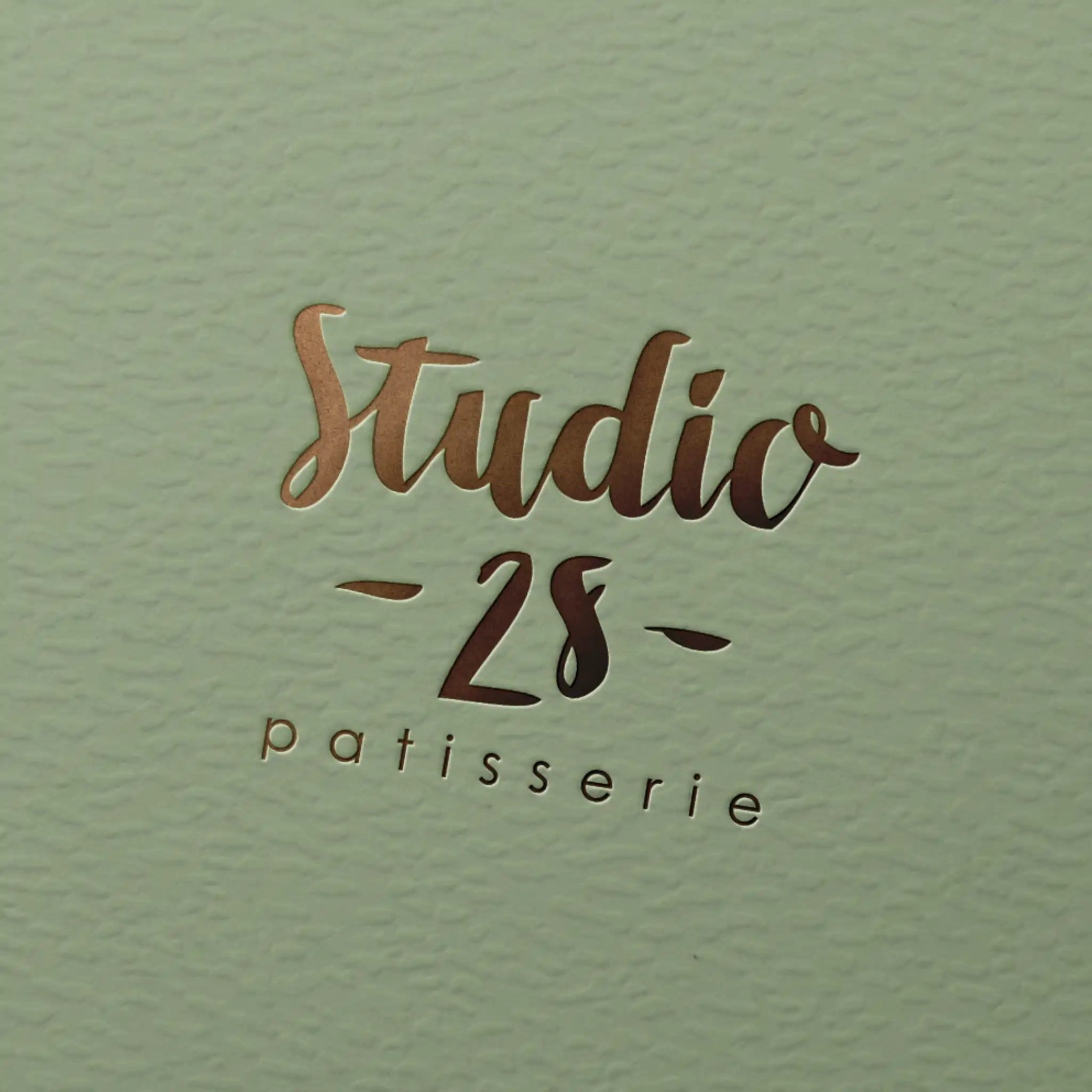
We decided to also foil the logo in certain positions to give the packaging a sense of luxury.
The finished result really works as a set on the shelves and on the website and we feel they now represent the quality of the product.
Brand Development
Branding
- Brand development
- Menu design and creation
- Tone of voice development
- Brand strategy
- Brand support
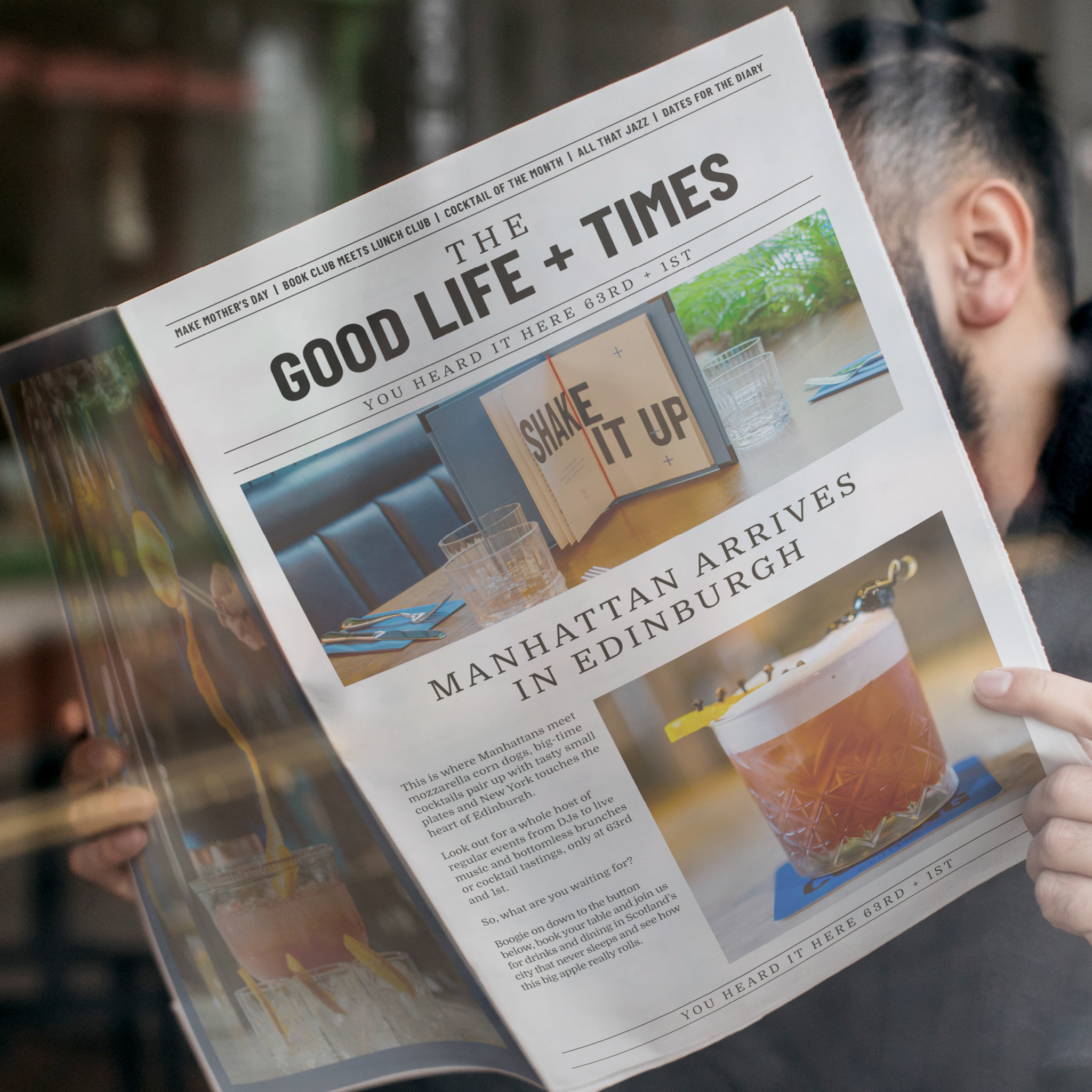
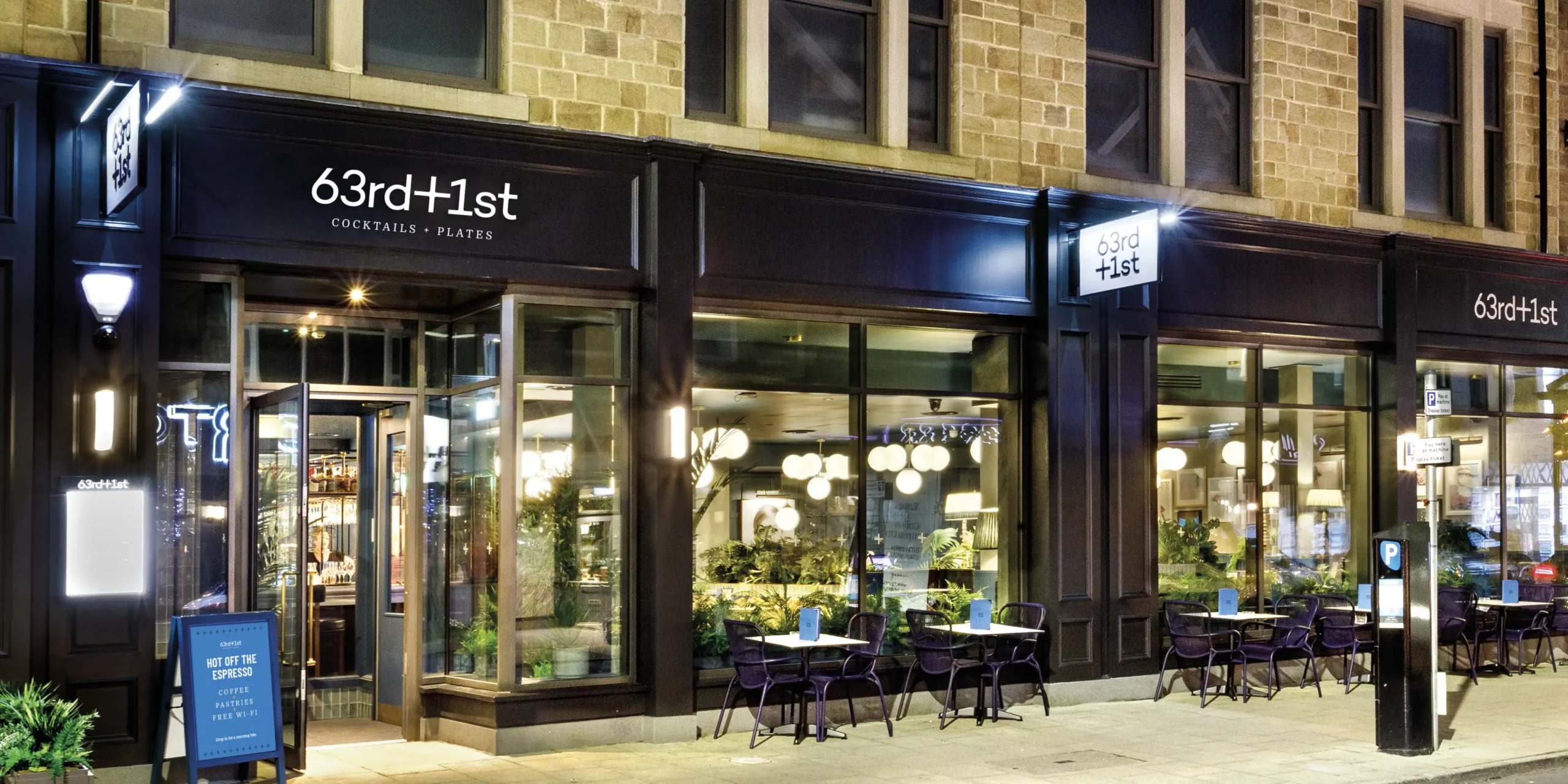
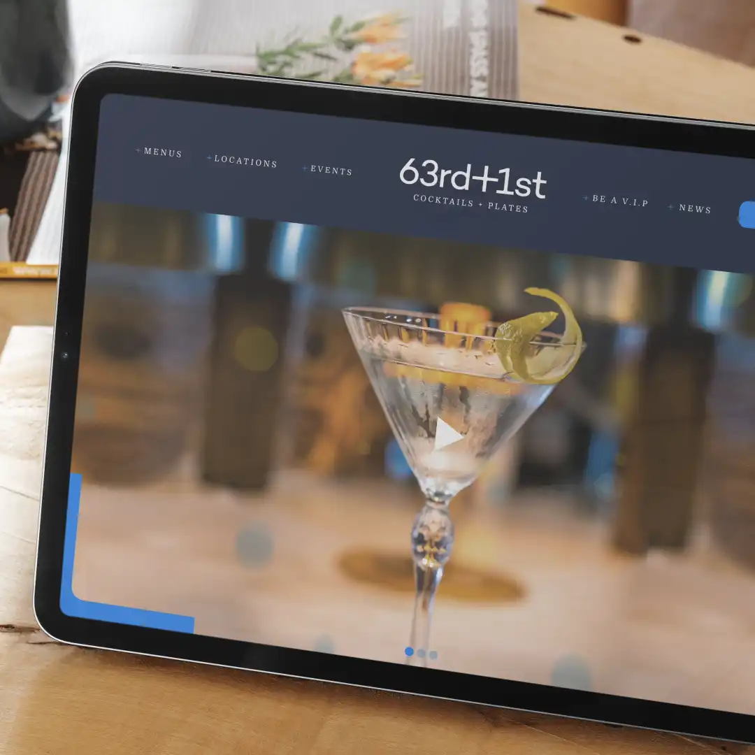
Inspired by the original TGI Fridays bar situated in New York back in 1965, 63rd+1st is a cocktails and plates lounge, that essentially brings a slice of NYC to a range of locations in the UK. We were asked to support the team in developing the brand, work on the brand strategy, and support them with their vision for the future.
This brand is in its infancy, and we’re excited to be involved, getting our teeth into it and developing a full brand strategy with their team to really understand the concept and direction they wanted to take the brand in.
We developed the creative and tone of voice across a range of assets they could work with, including website redesign and restructure, newsletter templates, communication, and brand awareness pieces, launch collateral and social campaigns.
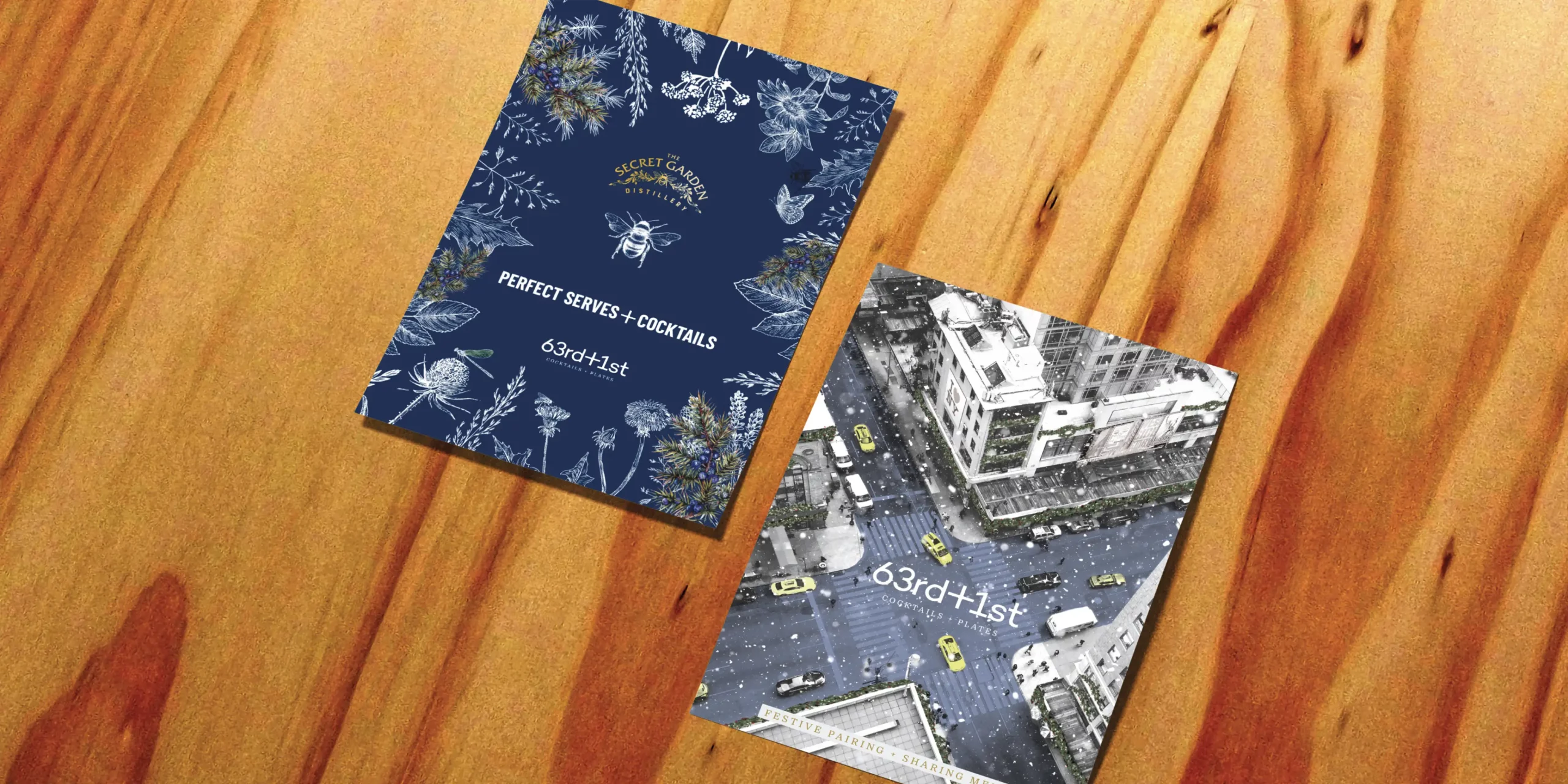
We also worked on new menu development and designs to make sure the whole brand feels like a real slice of NYC.
Menus, menus, menus
Branding

- Brand support
- Menu design and creation
- Project management
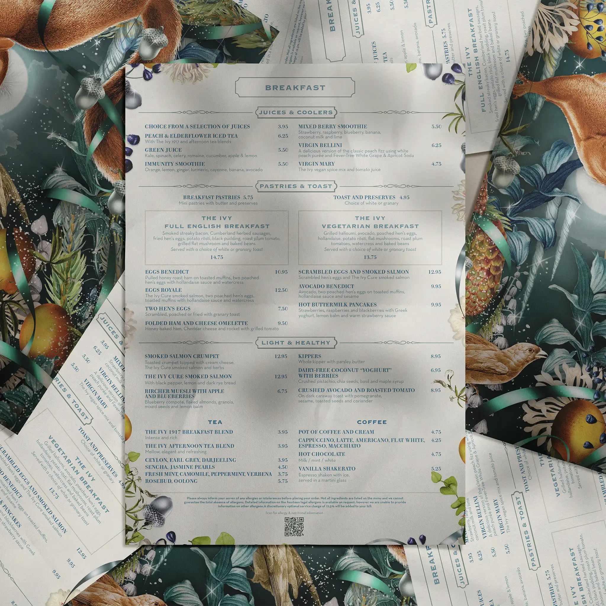
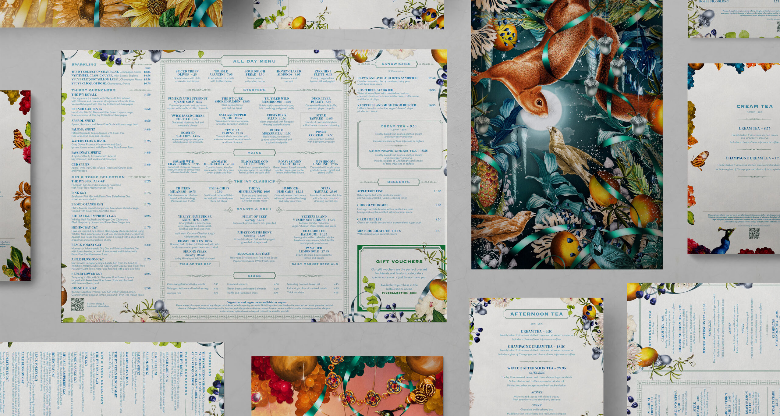
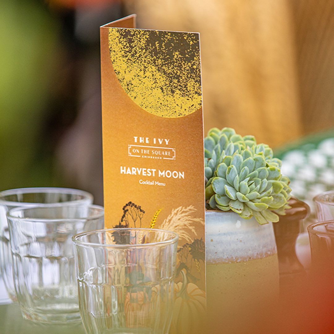
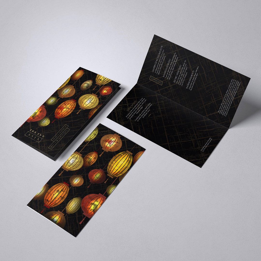
As The Ivy Collection’s creative partner, we work on a regular basis with their team to create and produce their suite of menus. As an iconic restaurant brand, these menus are an integral part of their brand vision and guest experience. We support their team with seasonal menu changes and any event and promotional menus throughout the year.
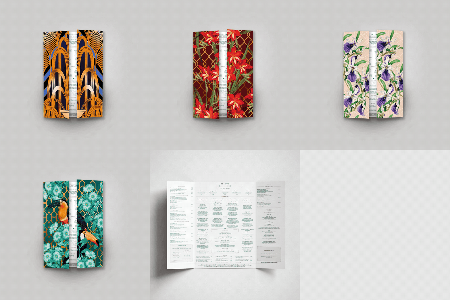
As an integrated part of the process, we work alongside The Ivy Collection’s brand & marketing team, food & beverage team and their Chef’s. The stunning illustrations created by Adam Ellis bring the seasonal menu changes to life and the print by IPW1 is meticulous and super-organised as these pieces are massively time sensitive. We’ve also been involved in creating some of the illustrations created for bespoke menus within our team at Curate.
These menus really exhibit the true ‘art of a menu’ and how a menu is a sensory, tactile part of the brand and guest experience. The production process is constantly being refined and improved, with a strong focus on team-work between the in-house team, printer and ourselves. The term ‘well-oiled machine’ describes this creative process perfectly, as it’s no mean-feat to turnaround such a vast amount in such a short period of time.
We think the results show the dedication all round and it brings a smile to our faces to witness a guest at The Ivy peruse the à la carte successfully.
Hotel Group Rebrand and Development
Branding

- Brand support
- Menu design and creation
- Project management
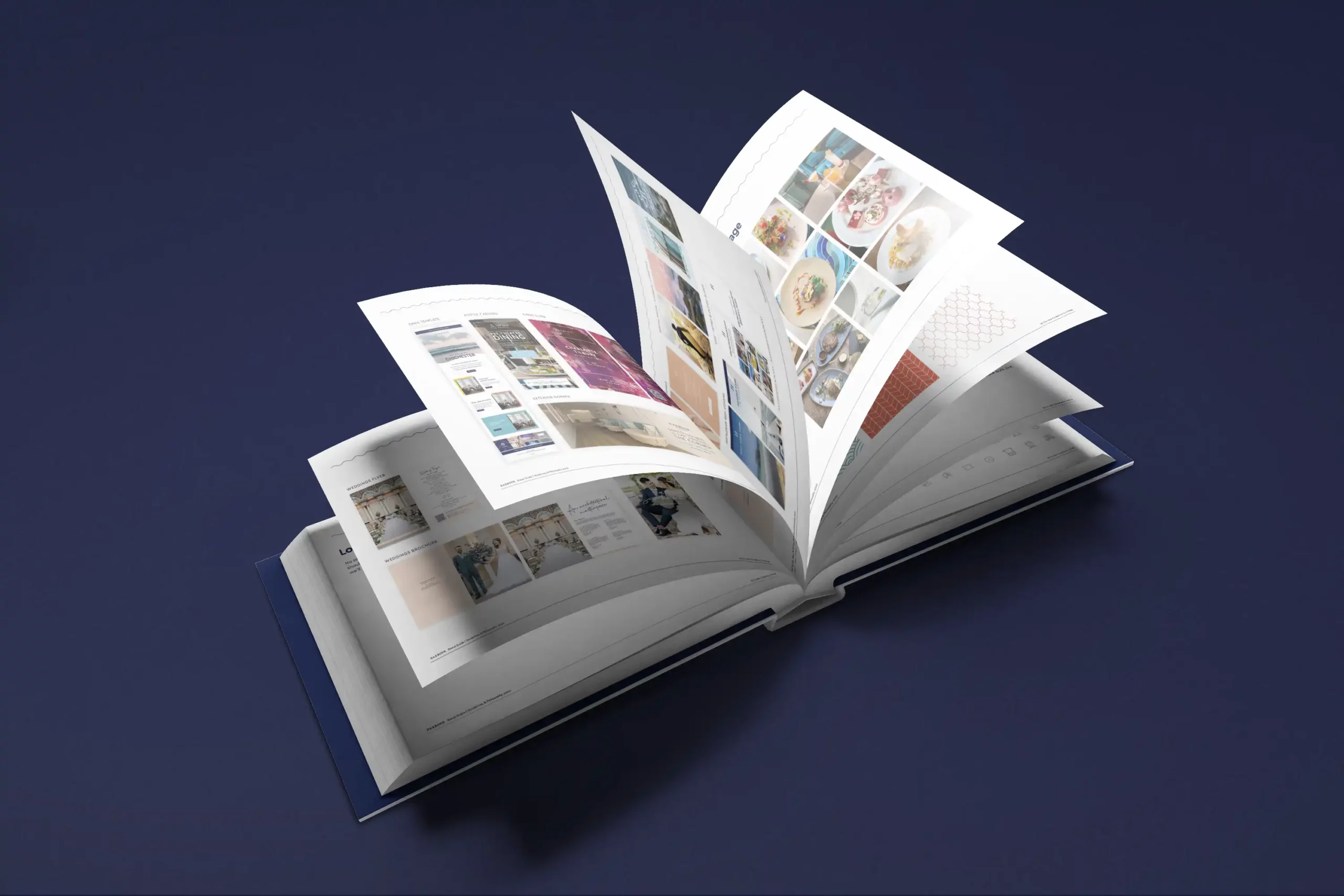
Harbour Hotels is the UK’s largest independently owned hotel group, with 15 locations across the South of England. We work together with Harbour Hotels as their creative partner. Initially, we were asked to come aboard to look at developing their overall brand and produce a full and extensive set of guidelines, which we were delighted to be involved with.
These guidelines as with any brand, evolve with time and working with their brand and marketing team we ensure these are kept up-to-date and relevant. We work as regular support to the brand from creation of top line campaigns to day-to-day menus and social media campaigns and assets.
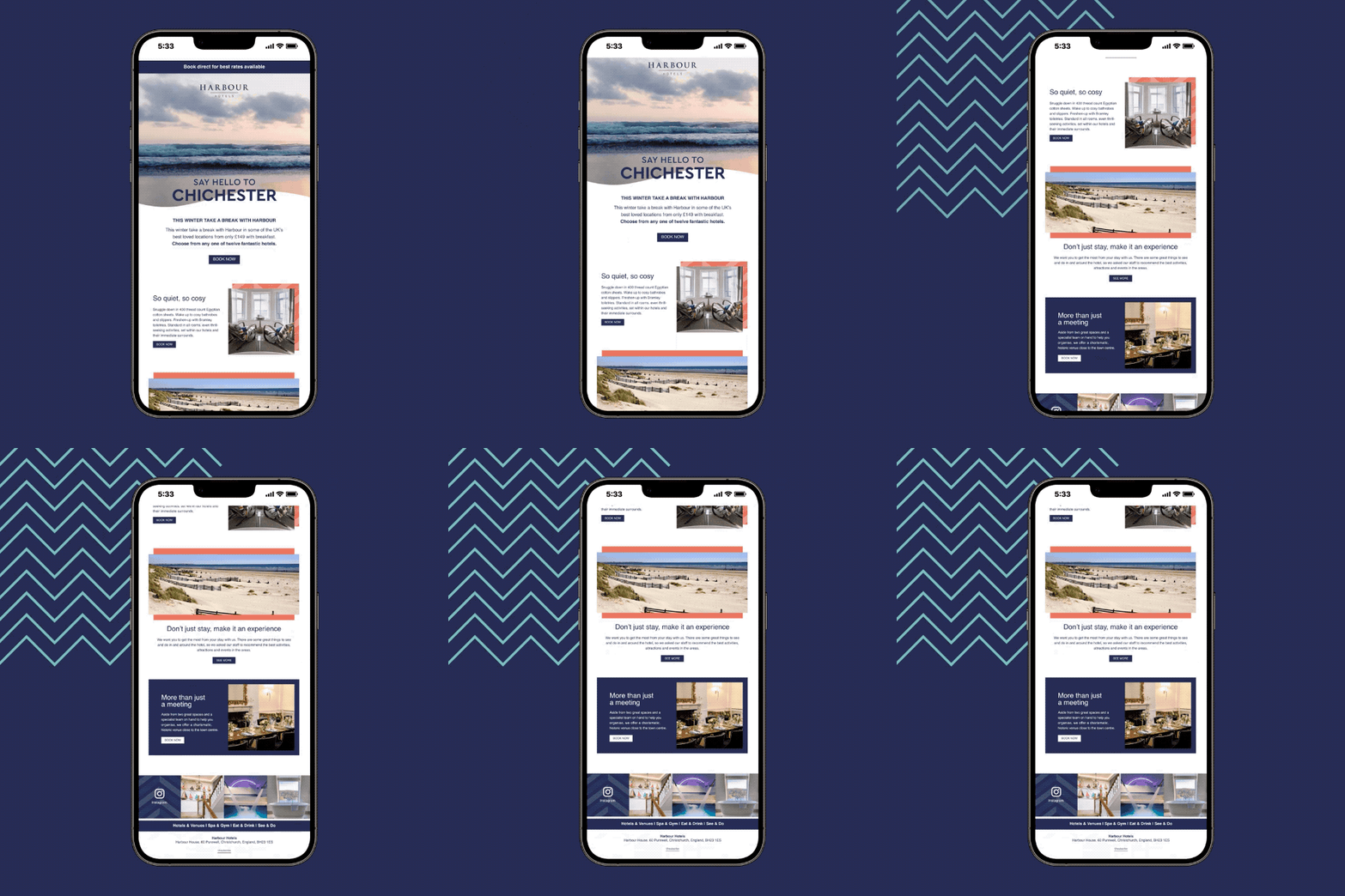
As part of the guidelines, we have created colour palettes, usage of typography and designed pattern assets. We’ve also worked on the tone of voice which we feel is integral to any brand and this is carried across any campaigns, messaging, and the website.
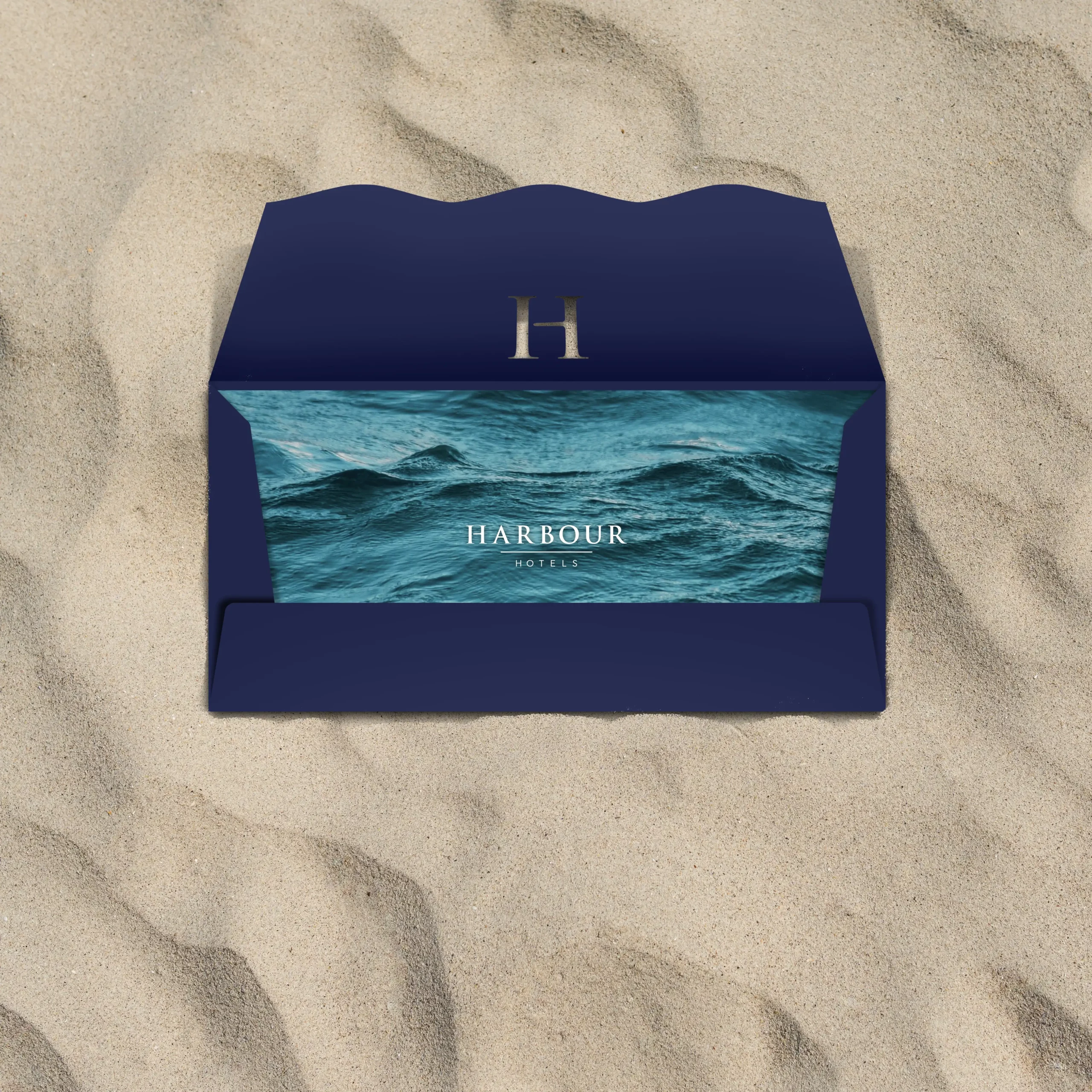
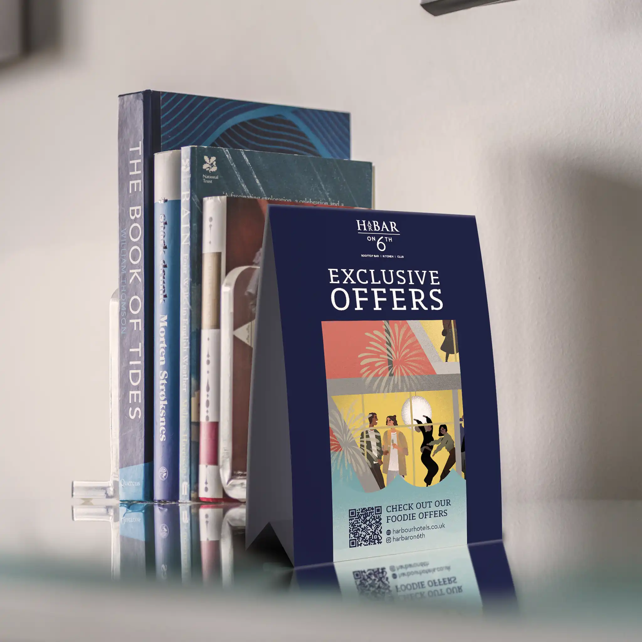
Within the guidelines we have kept room for creative scope, so there is always brand consistency, but range for creative ideas and executions some of which are pictured here.
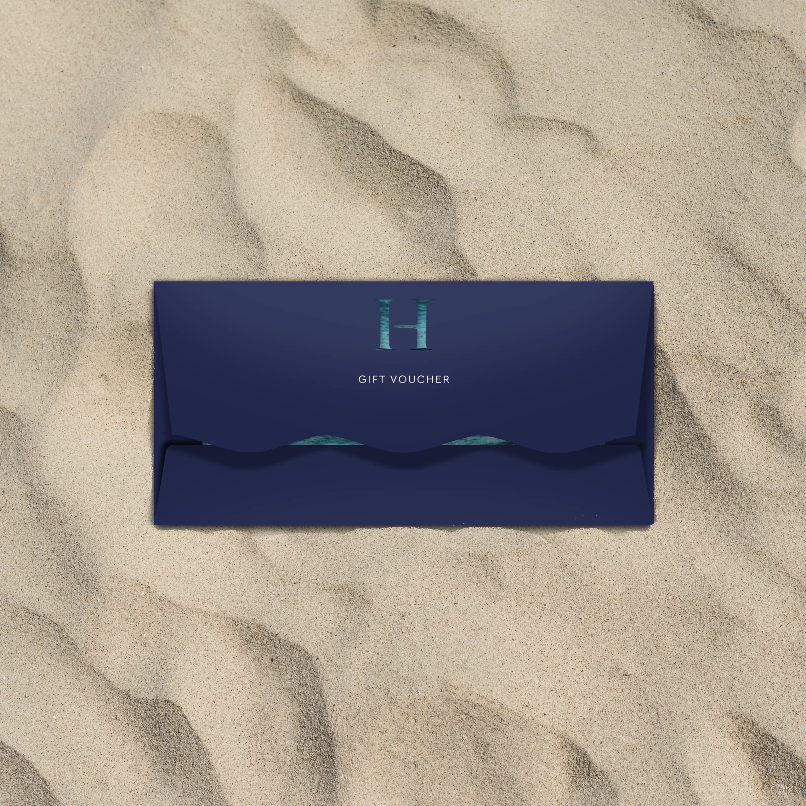
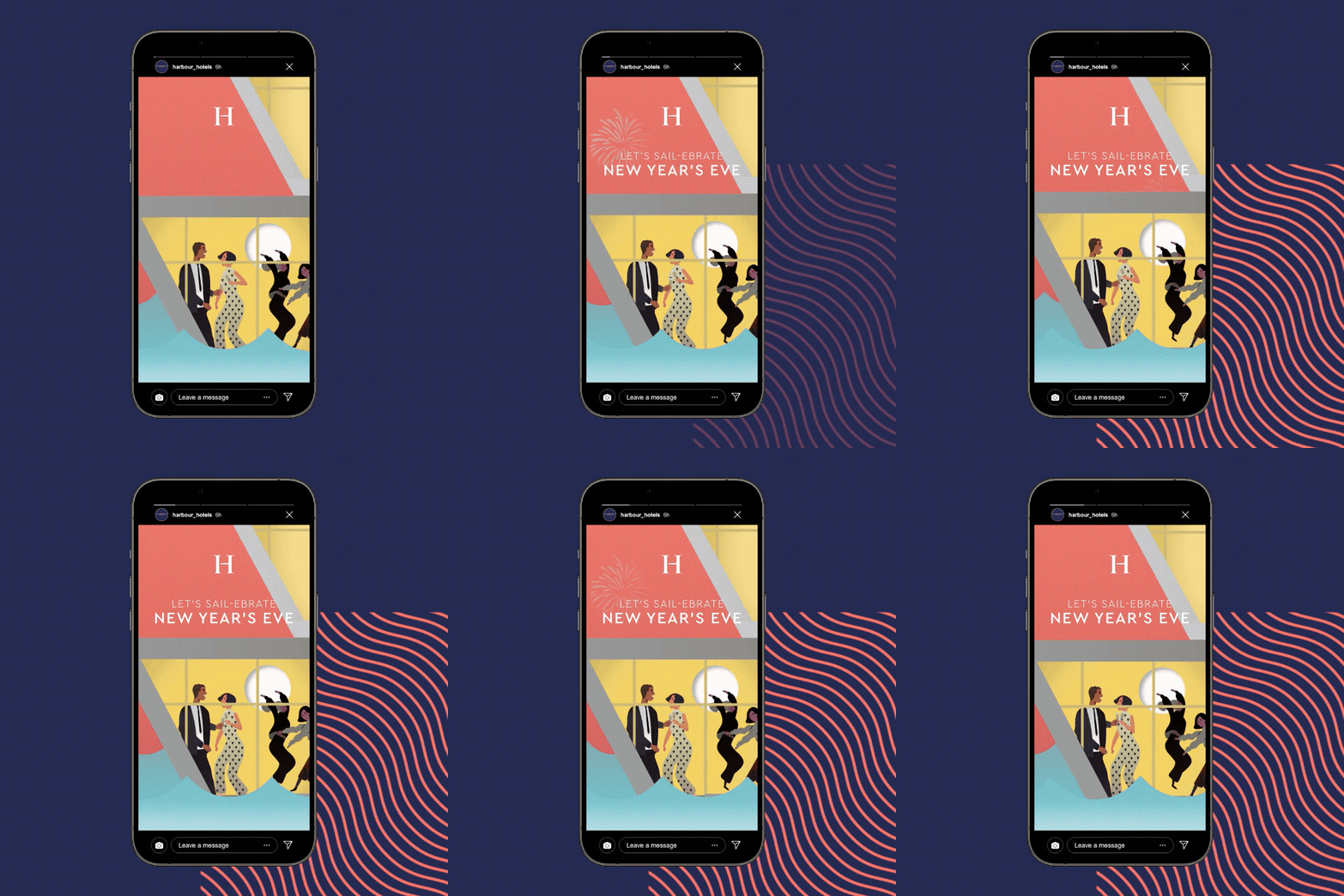
We have created illustrations for specific campaigns and then animated these over social assets. We’ve created gift cards and wallets that feel special to the recipient.
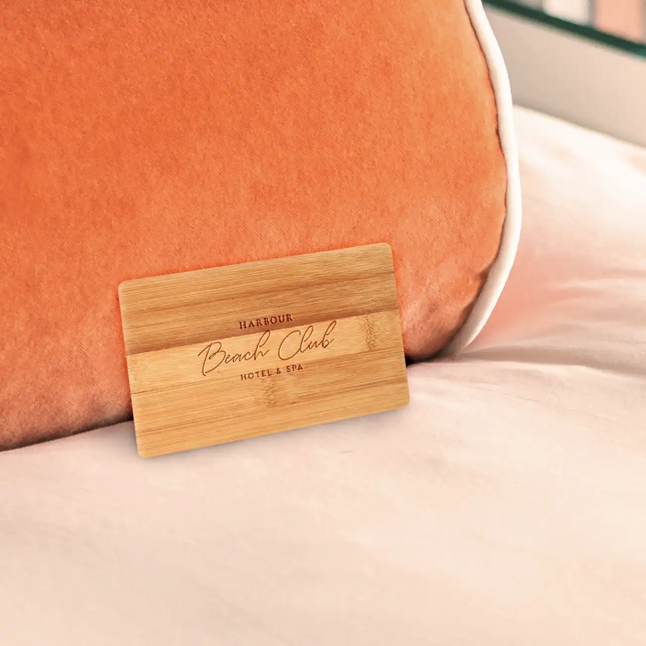
We work extremely closely with the brand to make sure their philosophies and beliefs are translated, such as the key card that is sustainable and created from bamboo. As it is one of their philosophies to be as plastic free as possible especially being largely coastal in location.
Watching their growth and being part of their development is something we’re extremely proud of.
